Project Summary
Smart Share Housing Solutions is a nonprofit organization in San Luis Obispo County that provides affordable housing by matching homeowners with available rooms to individuals seeking housing. Smart Share approached our team to redesign their website to create a more streamlined, user-friendly, and accessible experience, addressing issues with clutter and information overload.
The redesigned platform delivers a more credible, intuitive, and engaging experience for users. High-fidelity designs were approved by the client and are currently being implemented in development.
The Challenge
Smart Share Housing’s website felt untrustworthy and difficult to navigate due to information overload, design inconsistencies, and unclear communication of the organization’s mission. These issues overwhelmed users and made it harder to understand the purpose of the nonprofit or feel confident engaging with a donation-based platform.
Our users are individuals in San Luis Obispo County seeking housing support or community members looking to contribute to the cause. Within a 16-week timeframe, we redesigned the platform to improve credibility, strengthen user trust, and create a more engaging and accessible experience. Through user testing, user flow optimization, and iterative design, we developed high-fidelity designs that were approved by the client and are currently being implemented.
Results
I redesigned the About Us and Donation pages to build trust and credibility, clarify the organization's mission and impact, and create a cleaner, more intuitive user experience. The clients were highly satisfied with the high-fidelity designs, which are currently undergoing development and implementation.
User Needs and Potential Solutions
Based on user research conducted through 10 user interviews, we identified key user needs:
Trust & Professionalism: Consistent branding, clean visual design, and legible typography to inspire confidence.
Simple Navigation: Clear visual hierarchy, large buttons, and dedicated screens for key content.
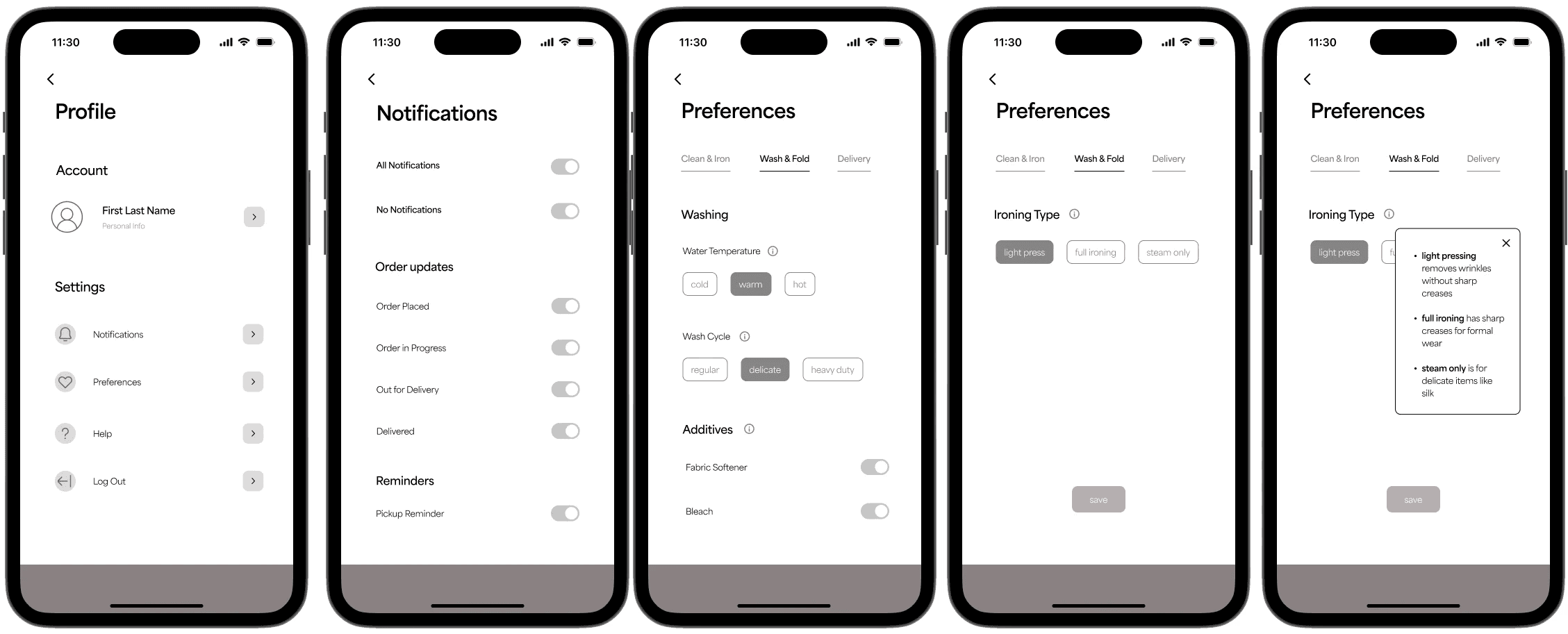
Order Control & Customization: Dedicated preferences page, save/reuse instructions, and order progress tracking.
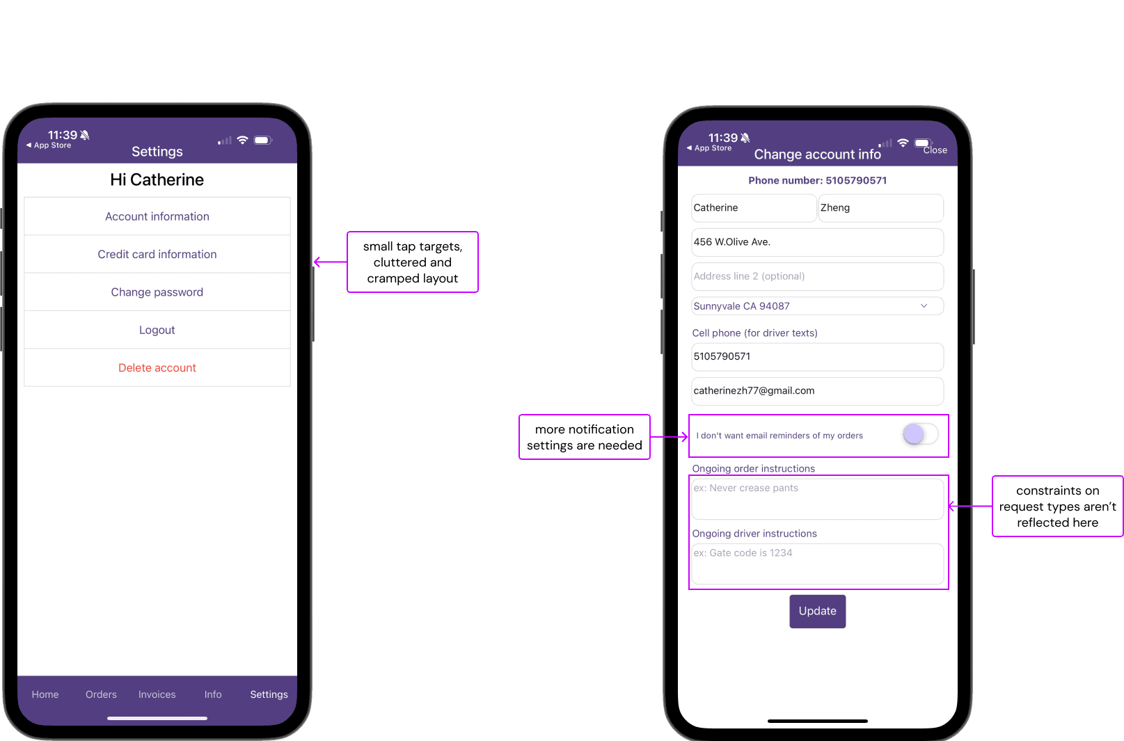
Users in particular needed specific guidance on what requests they could make for the instructions.
Mid and High Fidelity Designs
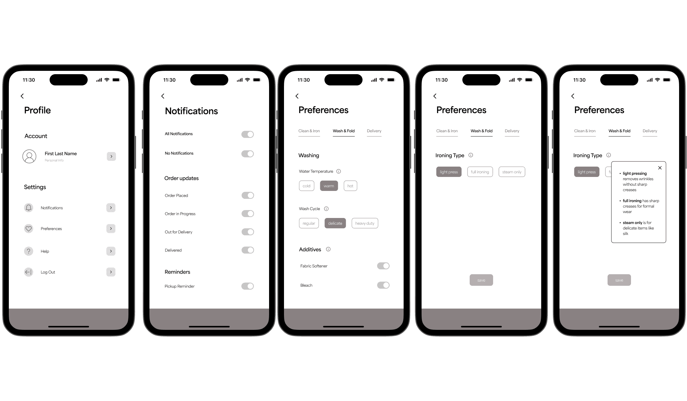
Mid-fidelity designs were iteratively refined based on feedback from stakeholders and design professionals, with a focus on progressive disclosure, transparency, and usability.
Initial concept (Lo-fi): Designed selectable buttons for user preferences that could be saved and reused for future orders, aiming to streamline repeat interactions.
Client feedback: The client requested replacing predefined selection buttons with open input fields to allow greater flexibility in user responses.
Usability challenge: During testing, users were uncertain about what kind of information they could enter into the input fields, leading to hesitation and inconsistent inputs.
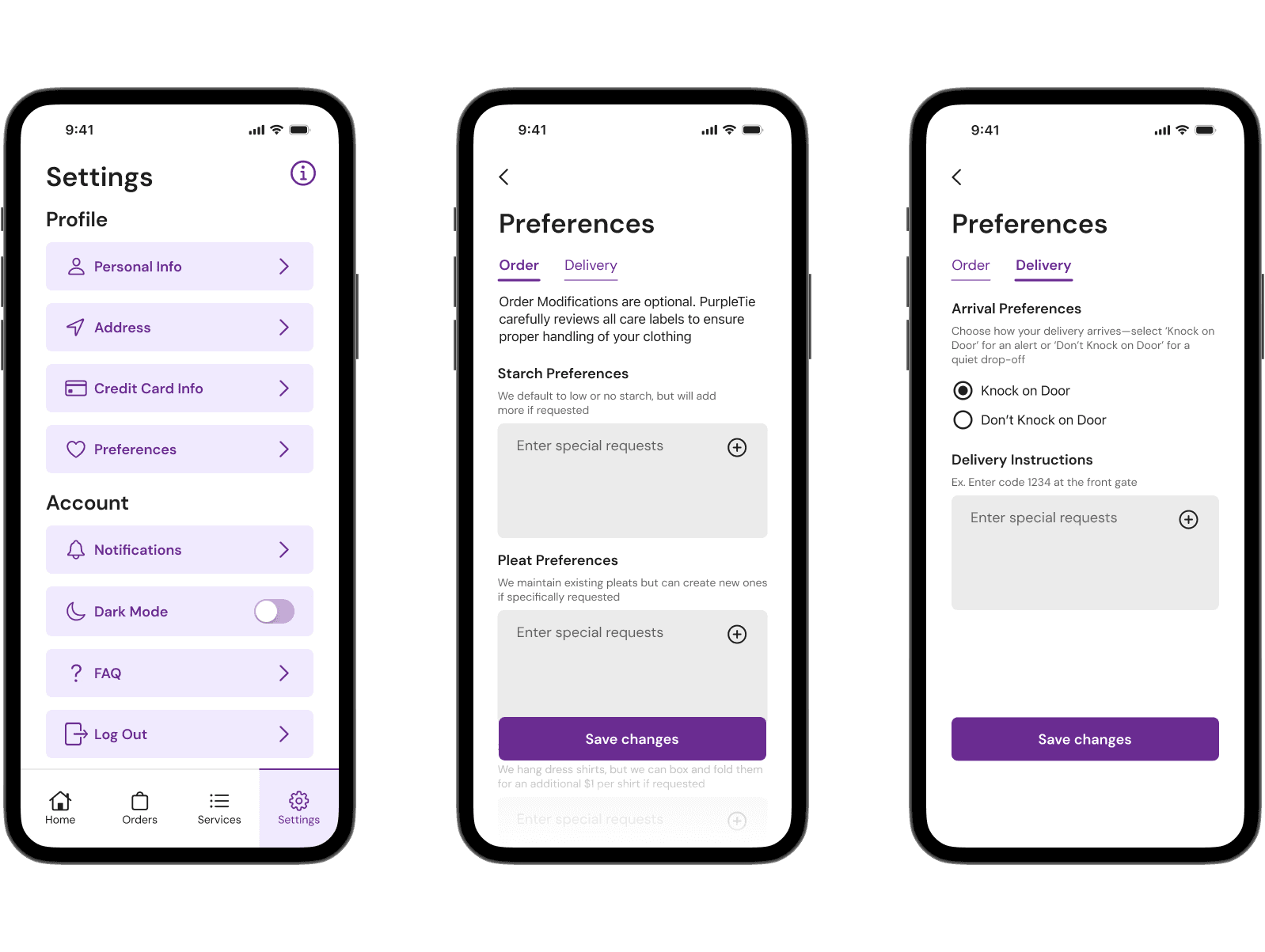
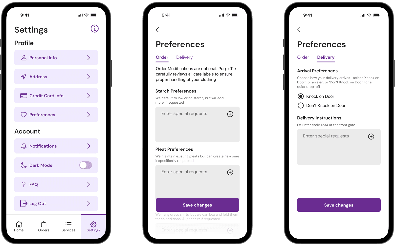
Design iteration (Hi-fi): Introduced concise helper text beneath each input field to clarify the expected type and range of responses.
Accessibility improvement: Replaced the information icon + tooltip with persistent text guidance, as the small tap target posed usability and accessibility challenges, particularly on mobile devices.